Modern CSS Layout: Flexbox, Grid and the End of Layout Hacks
The tools that replaced floats, clearfixes and a decade of workarounds.

5 min read

The tools that replaced floats, clearfixes and a decade of workarounds.
For roughly fifteen years, laying out a web page meant fighting the language. Floats were repurposed from image wrapping. Vertical centring was a running joke. Equal-height columns required either a table or a trick involving enormous padding and hidden overflow.
That era is over, and a surprising number of developers are still writing CSS as though it is not. Flexbox and Grid handle almost everything directly, and container queries closed the last significant gap.
This is a practical guide to what to reach for and when — including the newer features that let you delete rather than add.
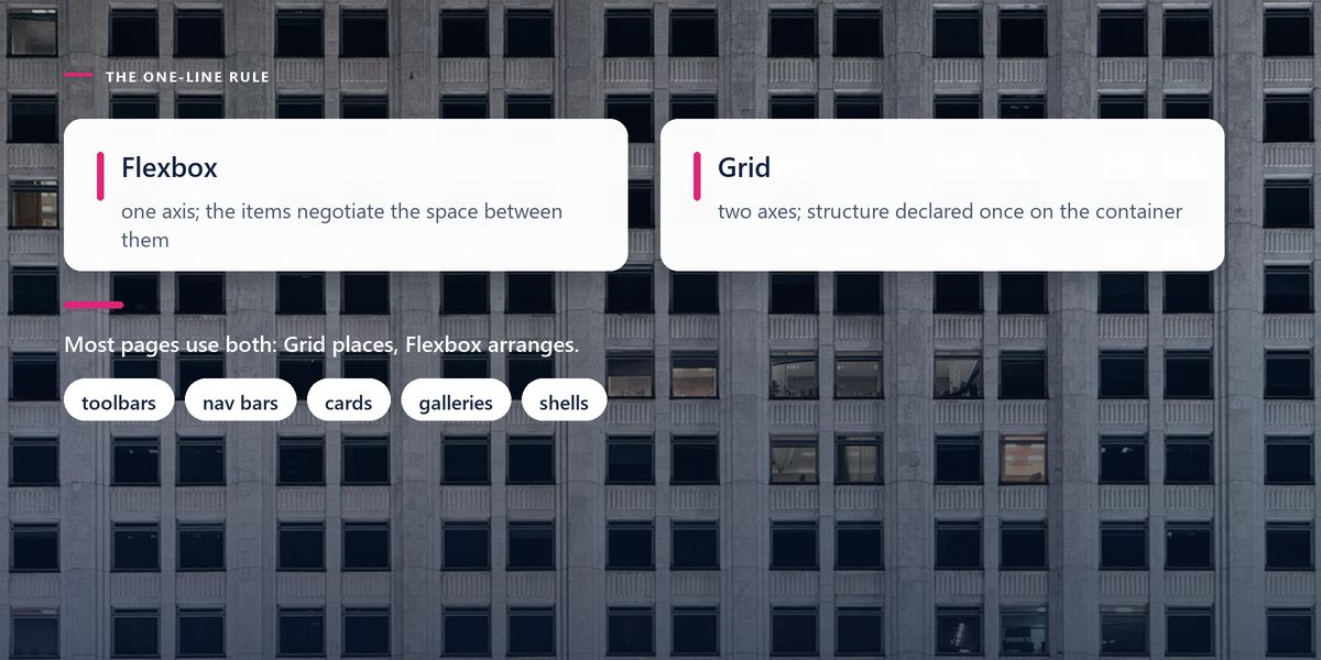
Flexbox lays out content along a single axis — a row or a column. Grid lays out along two at once, rows and columns together. That is the whole distinction, and it resolves the majority of cases immediately.
A navigation bar, a row of buttons, a card with a header and a footer pushed apart: one dimension, so Flexbox. A page with a sidebar and a main area, or a gallery aligned in both directions: two dimensions, so Grid.
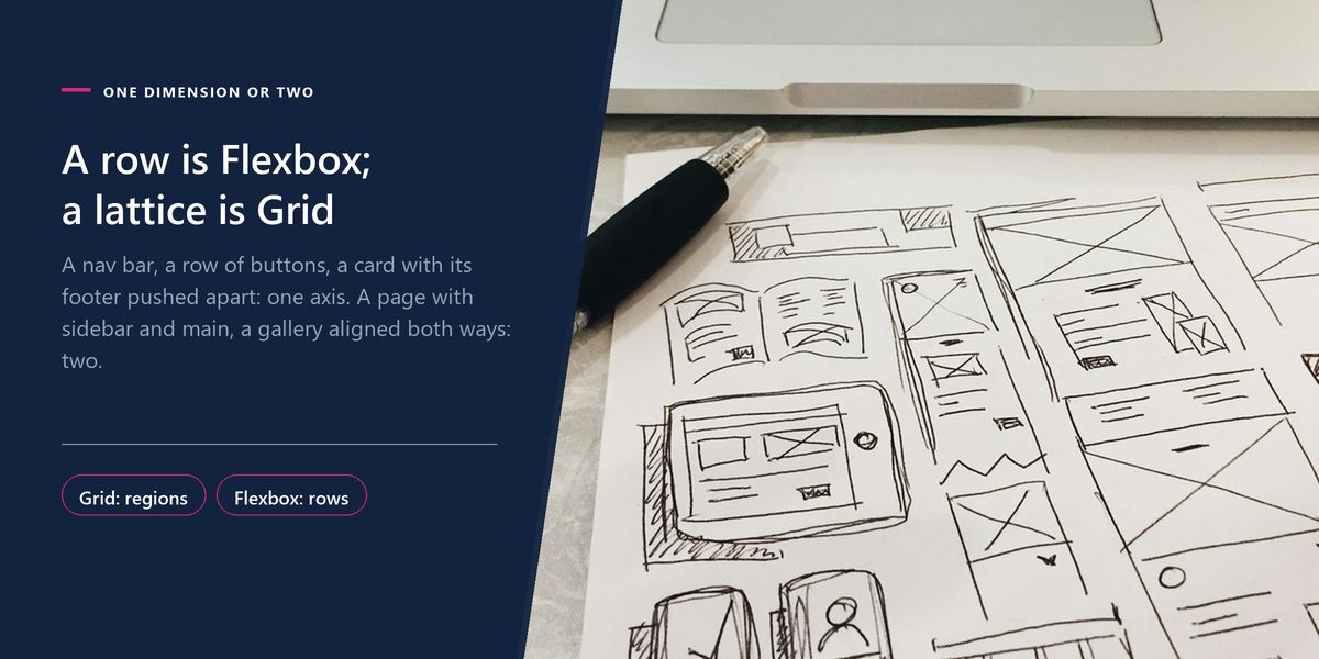
In practice, most real interfaces use both. Grid places the major regions of the page; Flexbox arranges the contents inside each one. They are collaborators, not competitors.
justify-content: space-between replaces an entire category of old margin arithmetic.margin-left: auto on a flex child pushes it to the far end — enormously useful in toolbars.Grid's real power is that the layout is defined on the container rather than negotiated by the children. You describe the structure once, and elements are placed into it.
Two features deserve particular attention. Named template areas let you draw the layout in your stylesheet as ASCII art, which is unusually readable and makes rearranging at different screen sizes almost trivial.
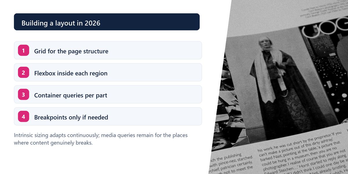
And repeat(auto-fit, minmax(240px, 1fr)) creates a responsive grid that fits as many columns as will comfortably fit and reflows automatically — with no media queries at all. For card grids, product listings and galleries, one line replaces four breakpoints.
Media queries ask how wide the viewport is. That was always a proxy for the real question, which is how much room this component has.
A product card in a full-width area and the same card in a narrow sidebar should look different — but the viewport is identical in both cases, so a media query cannot tell them apart. For years the workaround was passing size variants down as props or classes.
Container queries let a component respond to its own container's width. The card becomes genuinely self-contained: drop it anywhere and it adapts. For anyone building a component library, this is the most significant layout change in years.
| Feature | Replaces | Why it is better |
|---|---|---|
| Grid auto-fit + minmax | several media queries | one rule, reflows at any width |
| Container queries | size variant props | components adapt to their own space |
| gap in Flexbox | negative margins on wrappers | no wrapper, no edge cases |
| Logical properties | separate right-to-left stylesheets | direction handled automatically |
| clamp() for type | breakpoint-based font sizes | smooth scaling between two bounds |
| :has() selector | a JavaScript class toggle | style a parent based on its contents |
Reach for clamp() for fluid typography and spacing: clamp(1rem, 2.5vw, 1.5rem) scales smoothly between a minimum and maximum with no breakpoints. It removes the jarring jumps that appear exactly at your media query boundaries.
Writing margin-inline-start instead of margin-left means your layout adapts automatically to right-to-left languages. If your site might ever be translated into Arabic, Hebrew or Urdu, this converts a painful retrofit into no work at all.
Long requested, now widely supported: style an element based on what it contains. A card that has an image can be laid out differently from one that does not, without adding a class in JavaScript.
CSS variables are not just a way to avoid repeating a colour. They cascade, they can be redefined per component or per theme, and they can be updated from JavaScript — which makes theming a matter of changing a handful of values rather than shipping a second stylesheet.
A team maintained a dashboard with a card grid that had four media query breakpoints, a JavaScript resize observer to add size classes, and a set of wrapper divs whose only job was to manage negative margins for spacing.
The rewrite used Grid with auto-fit and minmax for the grid itself, gap for spacing, and container queries so each card chose its own compact or expanded layout.
Roughly 400 lines of CSS and the resize observer disappeared. More usefully, the cards became genuinely portable — dropping one into the narrow sidebar worked correctly the first time, which had never been true before.
Do not use Grid for a single row of items that should size themselves to their content. Grid tracks are defined by the container, so a row of buttons of varying widths is fiddly in Grid and effortless in Flexbox. Reaching for the newer tool is not the same as reaching for the right one.

Use Flexbox for one-dimensional arrangements and Grid for two-dimensional structure. Let auto-fit and minmax handle responsive grids, container queries make components self-contained, and clamp, gap, logical properties and :has() remove entire categories of old workaround.
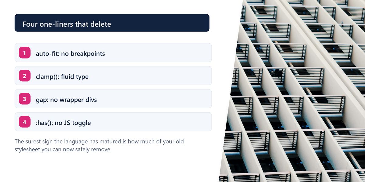
The best sign that CSS has matured is how much you can now delete. Layouts that once needed wrapper elements, resize listeners and four breakpoints often reduce to a handful of declarations that behave better at every width in between.
If you are rebuilding layout anyway, it is a good moment to check the result against accessibility basics — visual order and reading order can drift apart quickly once Grid is involved.
Tap a star to share what you thought.
No ratings yet
Use Flexbox when arranging items along a single axis, such as a navigation bar or a row of buttons, and Grid when you need rows and columns together, such as page structure or a gallery. Most real pages use Grid for regions and Flexbox inside them.
Not at all. They solve different problems. Grid defines structure from the container; Flexbox distributes space among items along one line. A row of variable-width buttons is far easier in Flexbox than in Grid.
A way for a component to respond to the width of its own container rather than the viewport. This lets the same card render compactly in a sidebar and expanded in a main column, with no props or classes controlling the variant.
Use repeat(auto-fit, minmax(240px, 1fr)) as your grid template columns. The browser fits as many columns as will comfortably fit at the current width and reflows automatically as the space changes.
Fluid sizing between a minimum and a maximum. clamp(1rem, 2.5vw, 1.5rem) scales a font size smoothly with the viewport while never going below or above your bounds, removing the abrupt jumps that happen at breakpoints.
Direction-relative equivalents of physical properties — margin-inline-start instead of margin-left, for example. They flip automatically in right-to-left languages, which turns a painful internationalisation retrofit into no extra work.
It styles an element based on what it contains — a card that has an image, a label whose input is invalid, a form containing an error. It replaces a common pattern of toggling classes on parents with JavaScript.
Let the content decide. Resize the layout until it starts looking wrong and add a breakpoint there, rather than targeting specific device widths. Better still, use intrinsic sizing so the layout adapts continuously and needs fewer breakpoints at all.
Sign in to join the conversation.
Loading responses…
Have a story, idea, or something valuable to share? Join The Blog Story for free, publish your content, reach more readers, and earn a share of advertising revenue from eligible content.
Create quality content. Grow your audience. Grow your earning potential.