Web Accessibility: The Practical Guide Most Teams Actually Need
Not a compliance checklist — the handful of things that genuinely unblock people.

6 min read
Not a compliance checklist — the handful of things that genuinely unblock people.
Accessibility work has an image problem. It is usually introduced as a legal obligation, presented as a 200-item checklist, and scheduled for a quarter that never arrives.
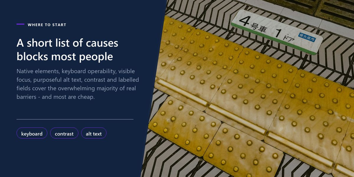
The reality is far less daunting. A small number of causes account for the overwhelming majority of real barriers, most of them are cheap to fix, and several are things you are already doing wrong for reasons that also hurt everyone else.
This guide covers the changes with the highest ratio of benefit to effort, and how to check them without specialist tooling.
The most valuable accessibility technique is choosing the right HTML element, and it costs nothing. A button is focusable, activates on Enter and Space, announces itself as a button, and works with every assistive technology ever built. A div with a click handler does none of those things.
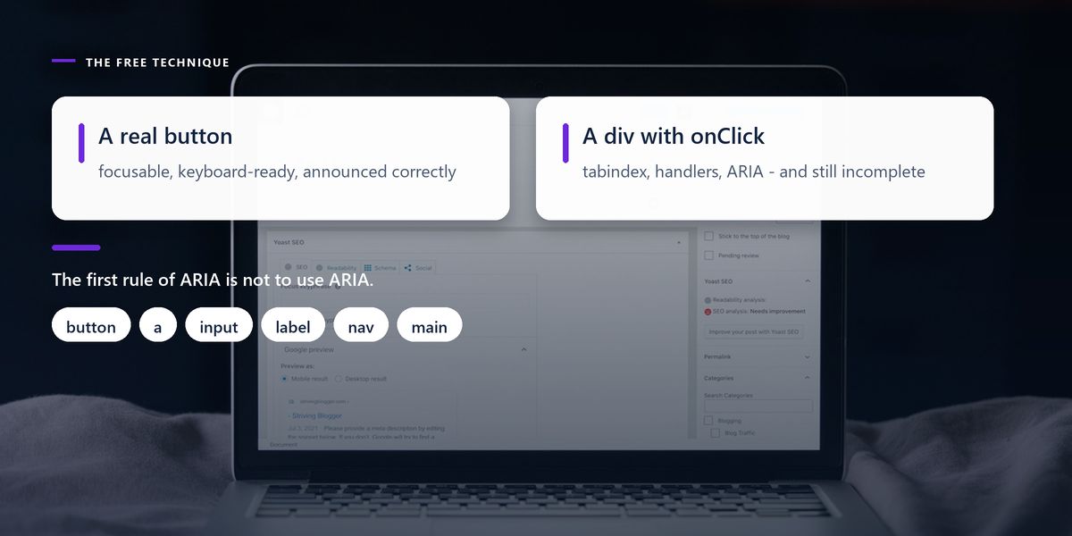
Rebuilding native behaviour on a generic element takes a tab index, keyboard handlers for two keys, an ARIA role, an accessible name, and state management — and it will still miss something. Every one of those problems disappears by using the correct tag.
button for actions, a for navigation. If it changes the URL it is a link; otherwise it is a button.input, select and textarea elements, each with an associated label.header, nav, main, footer — screen reader users navigate by these landmarks.h1, then h2 and h3 without skipping levels. Many users navigate a page entirely by heading list.The first rule of ARIA is not to use ARIA. If a native HTML element does what you need, use it — it already behaves correctly everywhere.
— A paraphrase of the specification's own advice
This affects far more people than most teams assume: anyone with a motor impairment, anyone using a screen reader, anyone with a temporary injury, and a large population of power users who simply prefer it.
The test takes two minutes. Put your mouse aside and try to complete your main flow with Tab, Shift+Tab, Enter, Space and the arrow keys. Three failures are common and all are serious.
Someone removed the focus outline because it looked untidy. Now keyboard users have no idea where they are on the page. If the default outline does not suit your design, replace it with something visible and attractive — never with nothing.
Open a dialog and keep tabbing: if focus wanders behind it into the page underneath, keyboard users are stranded. Focus must be trapped inside while it is open, and returned to the element that opened it when it closes.
Focus order follows the DOM, not the visual layout. CSS Grid and Flexbox make it easy to reorder things visually while the underlying order stays put, producing a tab sequence that leaps across the screen apparently at random.
The question to ask is not what is in this image but why is this image here. The same photograph needs different alt text depending on what it is doing on the page.
| Image | Poor alt text | Better alt text |
|---|---|---|
| Product photo | 'image1.jpg' | 'Blue running shoe, side view' |
| Chart | 'chart' | 'Revenue rose from 2.1M to 3.4M across 2025' |
| Decorative divider | 'decorative line' | empty alt, so it is skipped |
| Icon inside a button | 'icon' | empty alt; label the button itself |
| Author headshot | 'photo of person' | 'Priya Menon' — or empty if the name is beside it |
Two habits matter most. Do not begin with image of, because the screen reader already announces that it is an image. And genuinely decorative images should have an empty alt="" rather than no attribute at all — an empty alt means skip this, while a missing one causes some screen readers to read out the filename.
Low contrast text is the most commonly reported accessibility issue on the web, and it affects far more than people with visual impairments. It affects anyone in bright sunlight, on a cheap screen, or reading while tired.
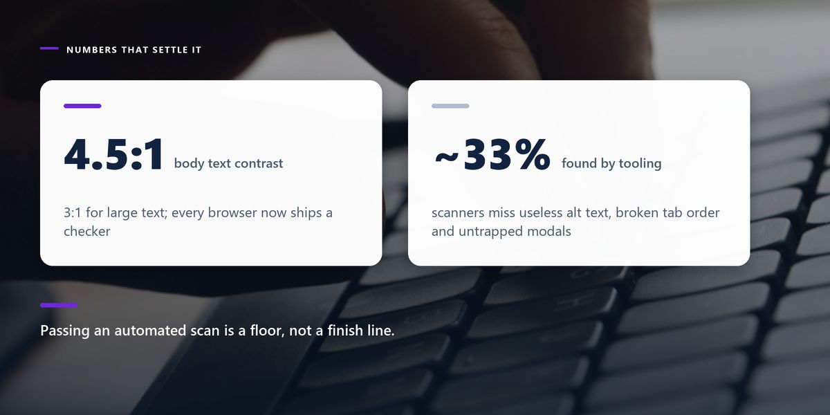
The standard threshold is 4.5 to 1 for normal body text and 3 to 1 for large text. Every design tool and browser now has a contrast checker built in, so this takes seconds to verify.
Separately: never use colour alone to convey meaning. A red field border is invisible to someone with red-green colour blindness. Pair the colour with an icon, a label, or explanatory text.
Give every form input a real label element connected to it, not just placeholder text. Placeholders vanish the moment someone starts typing, are frequently too low-contrast to read, and are not reliably announced by assistive technology. They are a hint, not a label.
Forms are where accessibility problems become expensive, because a blocked form is a lost transaction. Three rules cover most of it.
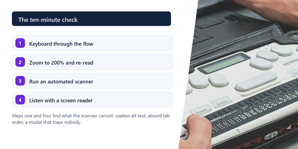
Formal audits have their place. This is what you can do before every release.
An online retailer noticed an unusual pattern in support tickets: a small but persistent number of customers said they could not complete checkout, without being able to explain why.
The cause was the payment step. The card form opened in a custom modal that did not trap focus, and the confirm control was a styled div rather than a button. Keyboard users could reach the modal, tab straight past it into the page behind, and never activate the control at all.
Two changes fixed it: a real button element and correct focus management in the modal. Both were under an hour of work. The tickets stopped, and an accessibility audit six months later found nothing serious in that flow.
Automated accessibility tools find roughly a third of issues. They are excellent at detecting a missing label or insufficient contrast and completely blind to alt text that is technically present but useless, a tab order that makes no sense, or a modal that traps nobody. Passing an automated scan is a floor, not a finish line.
Use native elements, make everything keyboard operable with visible focus, write alt text that describes purpose, meet contrast thresholds, never rely on colour alone, label form fields properly, and write error messages that say what to do. Then test with the keyboard, at zoom, with a scanner, and with a screen reader.
Almost every fix here also improves the experience for everyone else. Visible focus helps power users. Clear error messages reduce support load. Semantic HTML improves how search engines read a page. Sufficient contrast helps anyone outdoors.
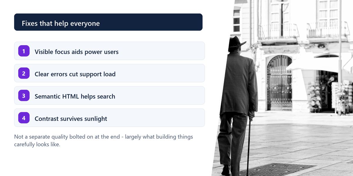
That is the argument worth making internally. Accessibility is not a separate quality bolted on at the end; it is largely what building things carefully looks like.
Tap a star to share what you thought.
No ratings yet
With semantic HTML and keyboard operability. Using real buttons, links, labels and landmarks removes a large share of barriers at no cost, and making every flow completable by keyboard catches most of what remains.
A description of why the image is there, in context, without starting with 'image of'. A chart's alt text should state the finding, a product photo should describe the product, and a purely decorative image should have an empty alt attribute so it is skipped.
At least 4.5 to 1 for normal body text against its background, and 3 to 1 for large text and meaningful interface elements. Browser developer tools and design software both include checkers that verify this in seconds.
Sign in to join the conversation.
Loading responses…
Have a story, idea, or something valuable to share? Join The Blog Story for free, publish your content, reach more readers, and earn a share of advertising revenue from eligible content.
Create quality content. Grow your audience. Grow your earning potential.
Not unless you replace them with something equally visible. The outline is how keyboard users know where they are; removing it without a replacement makes a site effectively unusable without a mouse.
No. Placeholders disappear as soon as the user types, are often too faint to read, and are inconsistently announced by assistive technology. Use a real label element and treat the placeholder as an optional hint.
No — roughly a third of issues. They reliably find missing labels, contrast failures and structural problems, but cannot judge whether alt text is meaningful, whether tab order makes sense, or whether a modal manages focus correctly.
A set of attributes that describe roles, states and properties to assistive technology. Use it only when no native HTML element does the job, because incorrect ARIA is worse than none — it overrides behaviour that would otherwise have been correct.
Yes, indirectly but meaningfully. Semantic structure, descriptive headings, alt text and clear link text all help search engines understand a page, and they are the same practices that help assistive technology.