Designing Mobile Interfaces That Feel Fast (Even When They Are Not)
Perceived speed is a design problem at least as much as an engineering one.

6 min read
Perceived speed is a design problem at least as much as an engineering one.
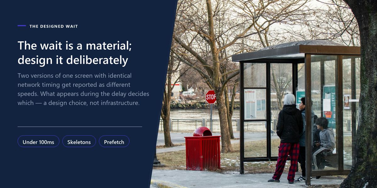
Here is a result that consistently surprises engineers. Take two versions of the same screen with identical network timing, change only what appears during the wait, and users will report one as noticeably faster than the other.
Not more pleasant. Faster. When asked to estimate how long each took, they give different numbers for the same measured duration.
Perceived performance is a real, measurable thing, and it is largely under the control of design rather than infrastructure. Which is fortunate, because it is far cheaper to change.
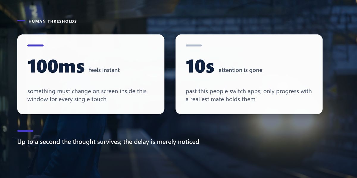
Human perception of delay has well-established boundaries, and designing around them is more useful than chasing an arbitrary millisecond target.
The single most important consequence is the first one. Something must change on screen within 100 milliseconds of a touch — not the finished result, just visible acknowledgement that the tap registered. A button that depresses, a row that highlights, a control that disables. Without it, users tap again, and now you have a duplicate request as well as an unhappy person.
Most actions in a well-built app succeed. Liking a post, marking a task done, adding to a cart — these fail rarely, and usually for reasons you can detect.
An optimistic update shows the result immediately and reconciles with the server afterwards. The heart fills the instant it is tapped. The request goes out in the background. If it fails, you revert the change and explain.
This is the single largest perceived-performance win available in most applications, because it takes the network out of the interaction entirely from the user's point of view.
Apply optimistic updates to actions that are frequent, usually successful, and cheap to reverse — likes, bookmarks, reordering, toggles, marking read. Do not apply them to payments, deletions or anything where showing a false success would be genuinely harmful.
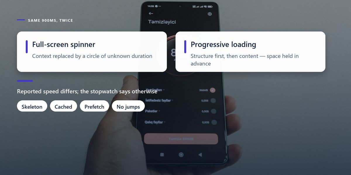
A spinner communicates one thing: something is happening, duration unknown. It gives the eye nowhere to rest and no sense of progress. Worse, a spinner replacing a whole screen erases context — the user cannot see what they are waiting for.
A skeleton screen shows the shape of the content that is coming: grey blocks where the title, image and body will be. It sets expectations, keeps the layout stable, and gives the impression that the page is assembling rather than stalled.
| Wait length | Right feedback | Wrong feedback |
|---|---|---|
| Under 100ms | nothing needed | a spinner that flashes and vanishes |
| 100ms to 1s | immediate state change on the control | a full-screen loading overlay |
| 1s to 10s | skeleton screen showing structure | an unlabelled spinner |
| Over 10s | progress with an estimate, and a way out | an indeterminate bar |
| Any failure | clear message plus a retry action | silently reverting |
The fastest request is the one that already happened. Mobile interfaces are unusually predictable — users move through flows in a small number of common sequences, and you can use that.
While someone reads a list, load the detail for the first few items. When they open step two of a form, fetch what step three needs. Cache the previous screen so going back is instant rather than a re-fetch.
Prefetching has a real cost in data and battery, so it should be bounded and ideally sensitive to connection type. But applied to the one or two most likely next actions, it converts a wait into no wait at all.
Rendering nothing until everything has arrived is a self-inflicted wound. If you already have the cached title and author but not the body, show the title and author. If images are still downloading, show the text and let images fill in — with their space reserved so nothing jumps.
That last point matters especially on mobile, where content shifting under a moving thumb causes mis-taps. Reserve the dimensions of anything that will load later, exactly as you would to avoid layout shift on the web.
A well-judged transition makes an interface feel faster by explaining where things came from and where they went. Tapping a card that expands into a detail view preserves continuity — the eye follows one object rather than processing an unrelated new screen.
The rules are simple and frequently broken. Keep transitions between 200 and 300 milliseconds; anything slower becomes something you wait for. Never block interaction during an animation. And always respect the operating system's reduce-motion setting, which some users need rather than prefer.
A team was under pressure to improve their app's speed. Their API responses averaged 900 milliseconds, and a proposed backend rewrite was estimated at two months.
They tried an experiment first. Likes and saves became optimistic, list screens got skeletons instead of a full-screen spinner, detail data for the top three visible items was prefetched, and the previous screen was cached for instant back navigation.
Measured API times did not change at all. In user testing, participants estimated the app as roughly 40% faster and the store rating for performance complaints dropped noticeably within a month. The backend rewrite was postponed and eventually descoped.
Optimistic updates must handle failure honestly. Showing success and then silently reverting when the request fails is worse than a brief wait — the user believes something happened that did not. Revert visibly and explain what went wrong, with a way to retry.
The single most common reason these problems ship is that the team tests on flagship devices connected to office wifi, sitting next to the server. Nothing on that setup is slow enough to reveal the problem.
Test on a mid-range phone that is three years old. Use network throttling to simulate a poor mobile connection. Try the app on a train. Everything wrong with your loading states will become obvious within about ten minutes.
Speed is not how long the operation takes. It is how long the person felt they were waiting — and those two numbers are only loosely related.
— The design principle underneath all of this
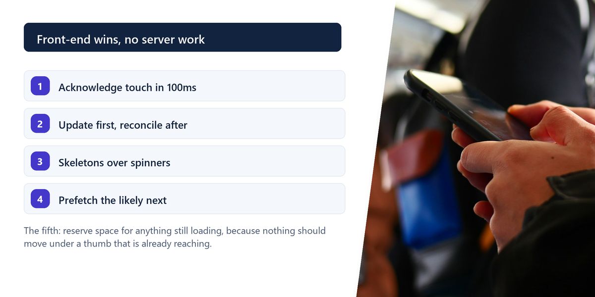
Acknowledge every touch within 100 milliseconds. Use optimistic updates for frequent, reversible actions. Replace spinners with skeletons that show structure. Prefetch the likely next screen. Render what you already have and reserve space for the rest. Keep transitions under 300 milliseconds and honour reduce-motion.
None of this is a substitute for a genuinely fast backend, and none of it excuses a two-second API call that could be two hundred milliseconds. But engineering speed and perceived speed are separate levers, and the second one is usually far cheaper to pull.
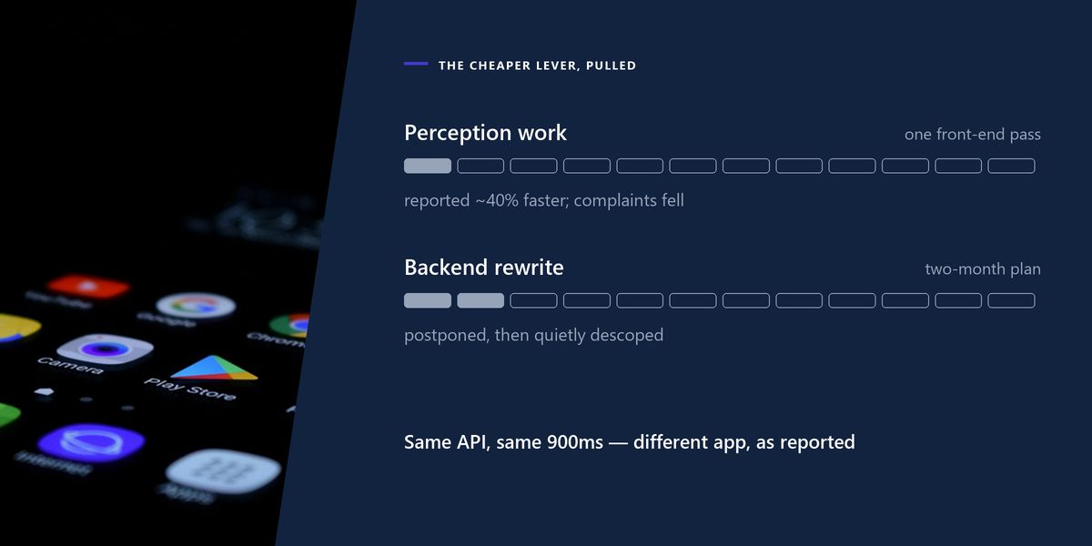
Pull it first. Then decide whether the rewrite is still necessary — quite often, it is not.
Tap a star to share what you thought.
No ratings yet
How fast an interface feels to the person using it, as opposed to how long operations actually take. Two screens with identical timings can be reported as noticeably different speeds depending on what happens during the wait.
Something visible should change within about 100 milliseconds — a pressed state, a highlight, a disabled control. Beyond that the response no longer feels caused by the touch, and users commonly tap again, creating duplicate requests.
Showing the expected result immediately and sending the request in the background, reverting if it fails. It removes the network from the perceived interaction and is the largest single perceived-performance win in most applications.
Sign in to join the conversation.
Loading responses…
Have a story, idea, or something valuable to share? Join The Blog Story for free, publish your content, reach more readers, and earn a share of advertising revenue from eligible content.
Create quality content. Grow your audience. Grow your earning potential.
For anything where a false success is harmful or hard to reverse: payments, deletions, irreversible submissions and legal confirmations. Use them for frequent, low-risk, easily reverted actions such as likes, bookmarks and toggles.
Generally yes, for waits longer than about a second. A skeleton shows the structure of the content that is coming, keeps the layout stable and reads as assembling, while a spinner communicates only that something unspecified is happening.
Loading data for a likely next screen before the user requests it. Bounded to the one or two most probable next actions, and ideally adjusted for connection type, the data cost is small relative to turning a wait into no wait at all.
Roughly 200 to 300 milliseconds for most transitions. Slower animations become something the user waits for, and no animation should block interaction. Always respect the system reduce-motion setting.
Because teams test on new devices with fast connections close to their servers. Testing on a three-year-old mid-range phone with throttled networking exposes almost every loading-state problem within minutes.