Design Systems for Small Teams: Start Small, Stay Useful
You do not need a hundred components. You need six decisions everyone stops re-making.

6 min read

You do not need a hundred components. You need six decisions everyone stops re-making.
There are two ways small teams get design systems wrong, and they look nothing alike. The first is having none: every screen invents its own spacing, six greys accumulate in the stylesheet, and buttons come in eleven subtly different heights.
The second is more painful because it involves months of work. Someone builds a comprehensive system up front — full component library, exhaustive documentation, elaborate naming — before anyone knows which components the product actually needs. Half of it is never used and the other half does not fit.
The version that works for a team of three to fifteen people sits between these. It starts with a handful of decisions, grows only when something repeats, and stays close enough to the product to keep being true.
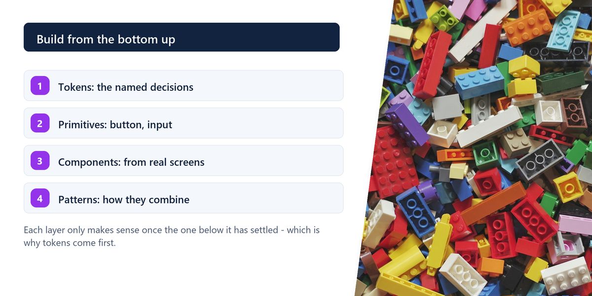
Tokens are the small, named decisions everything else is built from: your colour values, your spacing scale, your type sizes, your border radii, your shadows. They are unglamorous and they are the highest-leverage thing you will do.
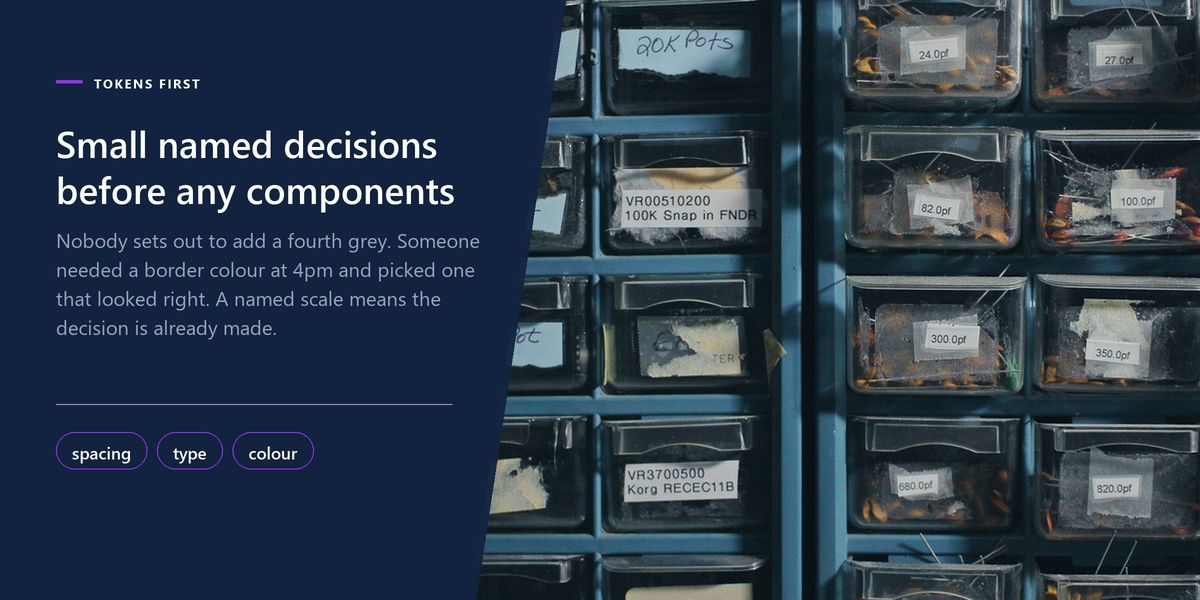
The reason is that inconsistency almost always starts here. Nobody deliberately introduces a fourth shade of grey; someone needed a border colour at 4pm, picked one that looked right, and now the codebase has four. A named scale means the decision is already made and picking from it is faster than inventing.
Pick a base unit — 4 or 8 pixels — and use multiples of it. Six or seven steps is plenty. The value is not mathematical purity; it is that nobody ever again types 13 pixels because it looked about right on their screen.
Five or six sizes with defined line heights and weights, each with a name describing its role rather than its size: display, heading, body, caption. Role names survive redesigns; text-18 does not.
Semantic names, always. colour-danger rather than red-500, surface-raised rather than grey-100. When you introduce dark mode — and you will — semantic names are the difference between changing a dozen values and auditing every file in the project.
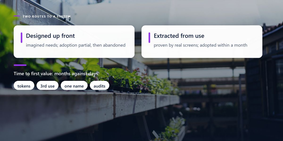
The rule that keeps a small system honest: build a shared component the third time you need it, not the first. The first use teaches you nothing about variation. The second suggests a pattern. The third tells you which parts actually differ and which are stable.
Systems built in the other direction — designing components speculatively for needs nobody has yet — produce an API with fourteen props, eleven of which exist for a hypothetical case. That component is harder to use than writing the markup directly, which means people quietly stop using it.
| Situation | Tempting move | Better move |
|---|---|---|
| First time you need a card | add it to the system | build it in the page |
| Third similar card appears | add a variant prop | extract now — you can see the real shape |
| A one-off marketing layout | generalise the component | leave it as a one-off |
| A component has 12 props | add a thirteenth | split it into two components |
| Two teams need different behaviour | add a mode flag | let the shared part be shared, fork the rest |
Most design system documentation lists what exists. That is the least useful part, because the component is right there and its props are visible in the editor.
What people actually need is the when. When do I use a primary button versus a secondary one? When is this a modal and when is it a full page? What do we do when a name is too long for the space? Those answers are what stop the system fragmenting, and they cannot be inferred from the code.
For every component, document one line on when not to use it. 'Use a modal for a short confirmation; do not use one for a multi-step form' prevents more inconsistency than three paragraphs describing the modal's props.
The most common failure in small teams is drift: the design file says Button/Primary/Large and the code exports PrimaryButton with a size prop. Both are reasonable. Together they mean every conversation includes a translation step, and eventually one of them changes without the other.
Agree the names once, in both places, and treat renaming as a change to both. It sounds trivial. It is the difference between a shared system and two parallel ones that resemble each other.
A useful filter, in order of priority.
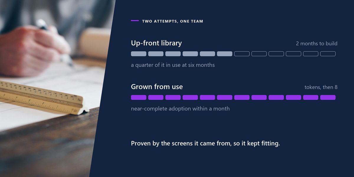
A five-person product team spent two months building a design system before their redesign. Forty components, a documentation site, a full Figma library. It was genuinely impressive work.
Six months later, roughly a quarter of it was in use. The components had been designed against imagined requirements, so real screens kept needing something slightly different — and the fastest route to slightly different was writing it from scratch.
The second attempt started from the opposite end: tokens first, then the eight components that already appeared on most screens, extracted from working code. Adoption was close to complete within a month, because every component had been proven by the screens it came from.
An unmaintained design system is worse than no design system. Once components drift out of date, people start copying and modifying them locally, and the library becomes a source of subtly wrong patterns that look official. If nobody owns it, keep it small enough that it does not need owning.
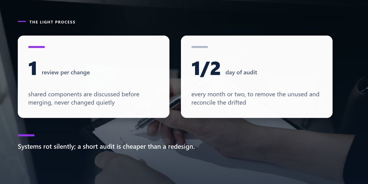
Small teams cannot staff a design systems team, and they do not need to. What they need is a light process: one person who reviews additions, a rule that changes to shared components are discussed rather than merged quietly, and a scheduled half-day every month or two to remove what is unused and reconcile what has drifted.
That last part matters more than it sounds. Systems rot silently, and a short regular audit is cheaper than the redesign that eventually becomes necessary.
Begin with tokens for spacing, type and colour, using role-based names. Extract components from real screens on the third repetition. Document when to use and when not to. Keep one vocabulary across design and code. Schedule a regular cleanup, and keep the system small enough that a small team can carry it.
A design system is not a deliverable. It is the accumulated set of decisions your team has stopped re-making, written down somewhere everyone can find.
Judged that way, six well-named tokens and eight solid components beat a forty-component library nobody trusts — every time, and by a wide margin. If accessibility is part of what you want to standardise, our practical accessibility guide lists the decisions worth baking into shared components from the start.
Tap a star to share what you thought.
No ratings yet
It needs the decisions, not necessarily the apparatus. A shared spacing scale, type scale and semantic colour set prevent most inconsistency on their own, and can be written down in an afternoon without any component library at all.
The small named values everything is built from: colours, spacing steps, type sizes, radii and shadows. They are the highest-leverage part of a design system because inconsistency almost always begins with someone inventing a one-off value.
Because role names survive change. When you add dark mode or rebrand, colour-danger and surface-raised keep meaning the right thing while red-500 and grey-100 have to be audited everywhere they appear.
Sign in to join the conversation.
Loading responses…
Have a story, idea, or something valuable to share? Join The Blog Story for free, publish your content, reach more readers, and earn a share of advertising revenue from eligible content.
Create quality content. Grow your audience. Grow your earning potential.
On roughly the third repetition. By then you can see which parts genuinely vary and which are stable, which produces a much simpler API than designing for imagined future needs.
Treat a growing prop list as a signal that it is really two components. A component with twelve props is usually harder to use correctly than two focused ones, and impossible to document clearly.
When to use a component and — more importantly — when not to. Props are visible in the code; the judgement about which pattern fits which situation is what people cannot infer and what keeps the system coherent.
One person as a reviewer, plus a rule that changes to shared components are discussed rather than merged quietly. A dedicated team is unnecessary; a scheduled monthly cleanup of unused and drifted components is not.
Yes. Divergent naming means every conversation includes a translation step and eventually one side changes without the other. Agree the vocabulary once and treat a rename as a change to both.